Travel Web Design Tips: Latest Trends, Q&A with Experts
HomeBlogTravel Web Design Tips: Latest Trends, Q&A with Experts
Share
Reading time: 20 min
What do people want these days when searching for travel bookings? They want to do everything online and give little to nothing efforts when it comes to finding the right information on the website. Also, they appreciate a smooth booking and payment process, with a pleasing visual experience along the way. It should not come as a surprise that the design choices you make affect this very user experience. Poor travel web design is often quoted among top reasons why visitors abandon their booking journey.
In the previous article, created in collaboration with our in-house UI/UX experts Natallia Mayorova and Viktoria Baichuk, we talked about the best practices, strategies, and most common mistakes in travel and tourism web design. This time, we asked our experts to share their travel and tourism web design tips and advice on some off-track aspects in the implementation of travel web design projects. Check what they have to say about design from a designer’s perspective.
#1. Why Is Travel Web Design More Important Than It Seems?
Chances are you’ve heard Ralf Speth, ex-CEO of Jaguar Land Rover, once noting: “If you think good design is expensive, you should look at the cost of bad design”. As everything goes online these days, you have literally moments to hook your visitors. Google talks about 50 milliseconds within which your website guests decide to stay or leave. User retention is one of the many advantages a wise design brings to the table.
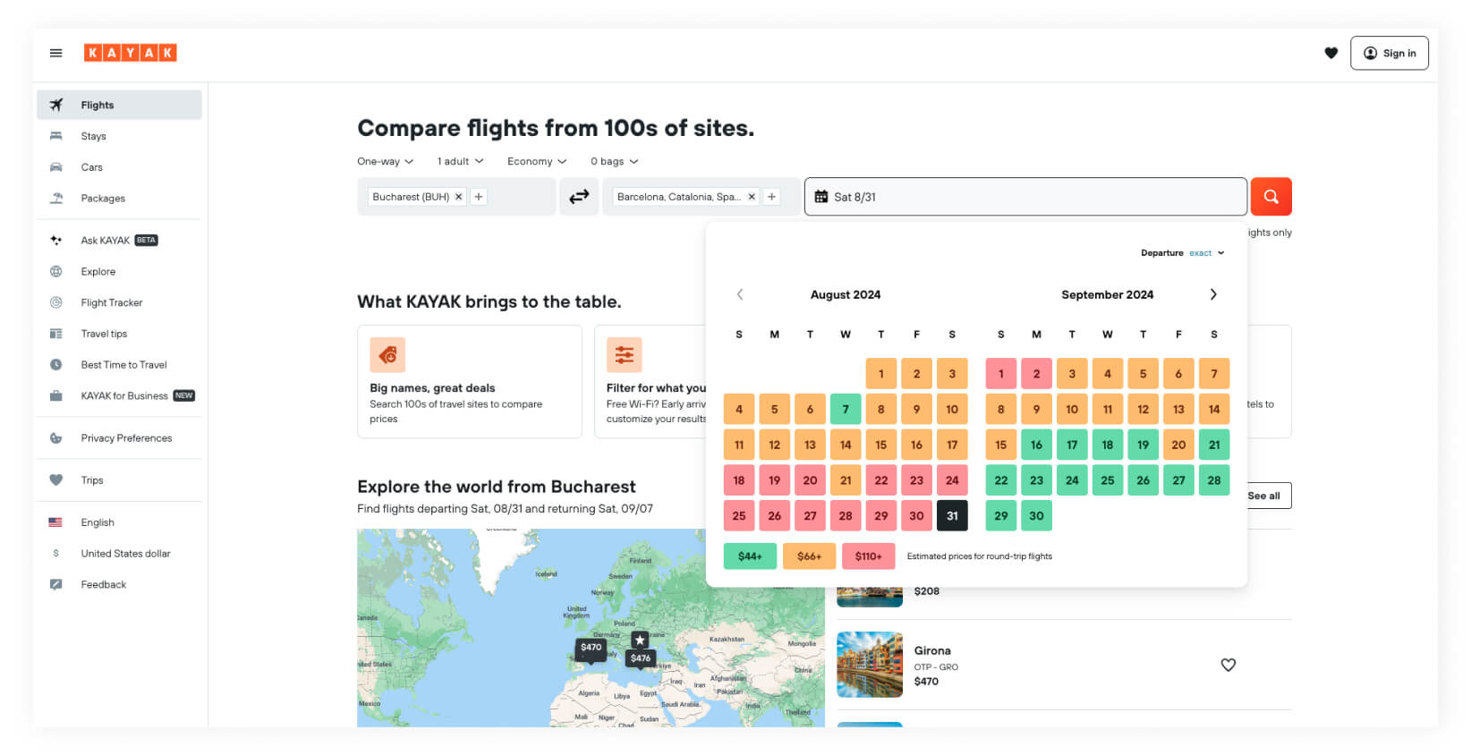
Design is a perfect tool to highlight key points and help your visitors have a more pleasant and informative experience. Check Kayak’s example.
When selecting travel dates, users get to see the calendar with days in different colors corresponding to the price range. Such a simple yet effective illustration helps you better understand how the prices are scattered, so you can choose a better deal if you are flexible in your dates.
#2. Is Web Design for Travel Much Different from the Rest?
The workflow is pretty much the same, as is the target audience at large. Yet, as travel and, say, fintech websites offer different kinds of products, the travel website’s success in fulfilling its mission largely depends on its own set of components. This may include high-quality visuals, familiar and simple functionality, transparent search and booking processes, travel planning tools, and easy-to-understand content with no unfamiliar technical terms.
FINTECH DESIGN WITH ASCETIC VISUALS AND FOCUS ON NUMBERS
TRAVEL DESIGN WITH RICH IMAGERY AND FOCUS ON VISUAL APPEAL
Ideally, it should be users who point out the website’s drawbacks. Yet, such feedback may be scarce or absent at all. That is why, if you choose a service provider with experience in travel industry web design, it will be a competitive edge. Such guys have certainly been through a lot and know what’s the best for your particular case and what may completely ruin your business.
Thinking about redesigning your travel website? Let’s have a call!
Tanya
Business Development Expert
#3. How Does the Design Process Look Like?
The final working scheme will depend on your particular situation, goals, and budget, yet in general we follow this flow.
We have a deep interview with the client to determine their objectives, including why they want to craft a new design in the first place. This stage involves determining if we are developing from ground zero or replacing an existing site. In the latter case, we identify the current issues and conduct our own audit of the client’s existing product.
Next, we perform a competitive analysis by reviewing both direct and indirect competitors to understand the client’s specifics and grasp the market offerings and the direction we should take.
This is followed by selecting references, agreeing on a mood board, and determining the overall style of the future website.
Together with the client, we set on the website structure and obtain the content to fill initial mockups.
After the design development, we present the website to the client to get their feedback.
After the requested adjustments, we work on animations, hover effects, and prototyping the final site if required to deliver the final version.
Say farewell to ineffective designs and chaotic layouts. Let us sort it out for you!
The target audience of a travel agency’s website are average users, so your UI/UX should be intuitive, simple, easy-to-use, and attractive. Focus on function, not looks. The most crucial elements include:
An easy and familiar search and booking flow with all the necessary filters;
Responsive layouts so your website looks great on both desktops and mobiles;
A convenient registration method, with form autofill options based on data from previous bookings to minimize mistakes a user might make during bookings;
Secure payment processing.
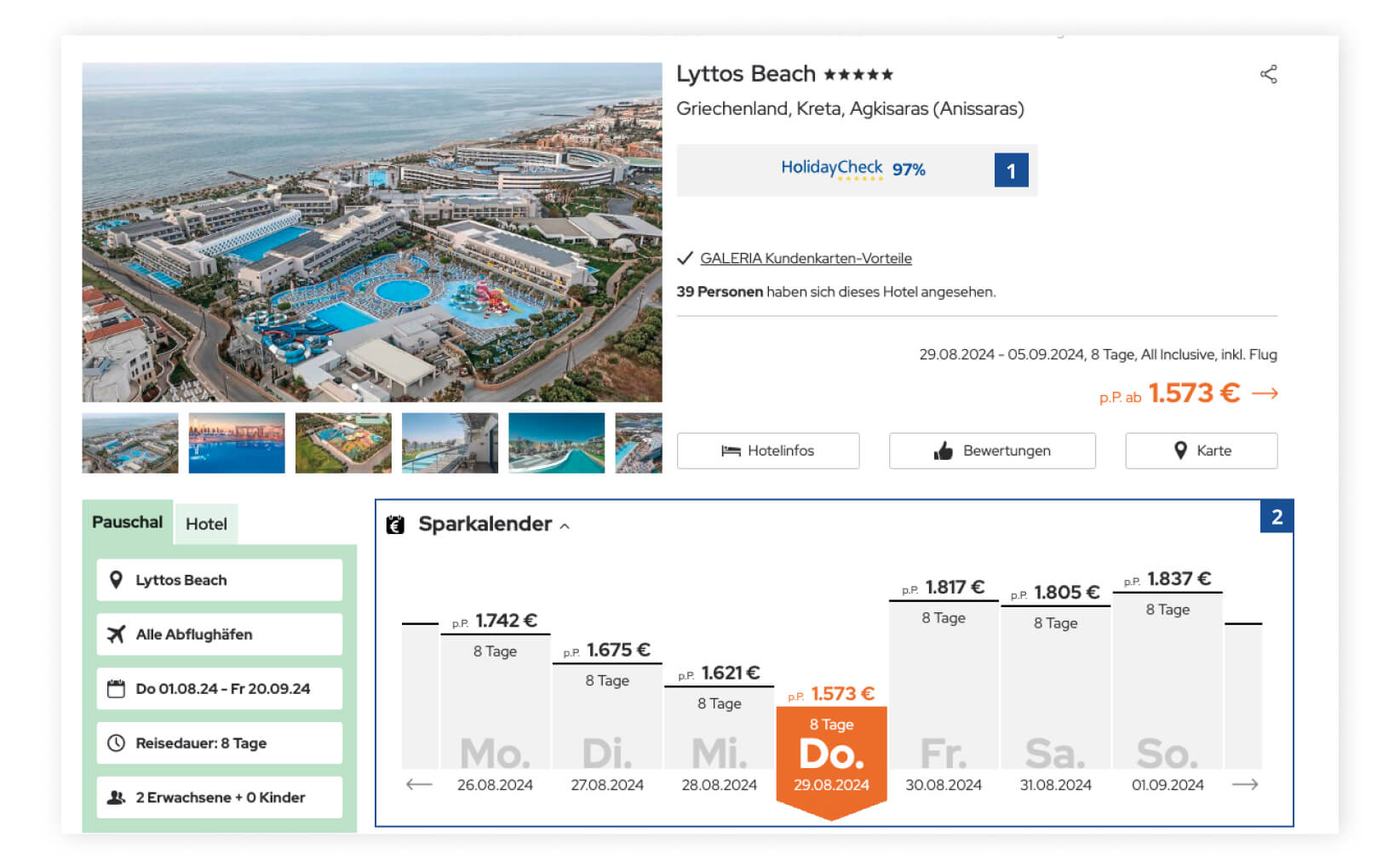
Try adding some features which will distinguish you from the rest and be really helpful for your buyers. For instance, when working on the project for Galeria Reisen, we added the integration (1) with HotelCheck, a comparison and hotel booking platform, so tourists can make more informed bookings. Another convenient addition (2), SparKalender, displays the price spread for the selected travel service over a separately defined period of time, enabling you to save money if you can travel a day or two earlier or later.
#5. How Does the Target Audience Influence the Design?
Before anything else, think carefully who your target audience is. Is your website intended for tour operators, leisure travelers, or your own employees? The answer to this question will define your general approach to user experience (UX) design. In the twenty-plus years we’ve been in the business, GP Solutions created all kinds of e-tourism solutions — from a travel website where ordinary users can look for vacation destinations and book adventure trips to corporate multipage websites for travel agents and high-load travel portal software. They all serve different purposes and audiences, and the visual side of things must correspond to the website’s mission.
If your target audience are business travelers, they will surely expect visually attractive but not overly bright design for an easy-to-navigate website that will convey the notion of reliability, status, and comfort. If you offer services to a broader audience, then you have more freedom here in terms of your UI/UX design approach, as you might want to strike a chord with both baby boomers and Gen Z (B2C websites).
If users of your website are travel agencies, tour operators, and DMCs (B2B websites), that’s a different story. Feel free to check the table below to get the main differences between the two.
Audience
B2C
B2B
Focus
Visual appeal, then functionality
Functionality first, visuals second
Target
Greater focus on visuals, more detailed information about destinations, effective sales process, and increased conversion rate
Speed and comfort of operations for travel agents, rich functionality
Ease of use
You don’t have time to teach your visitors how to use your website, that’s why you have to do it user-friendly from the start.
The client wouldn’t mind arranging software training for employees. If your travel portal software is stable and has all the features your client requires, its ease of use will be a plus, but not a must.
Content density
Display only the essentials, as excessive information may confuse the user who only needs some tiny bits of it and may also have a hard time during the search and booking process.
Sometimes you have to spill all the information. It may be bulky and too complex at first sight, but after the adaptation period, your user will know how to use your system, and it may turn out that this abundance of information is exactly what they require.
Example of feature implementation
Slider Widget functionality (you can see photos without clicking on the property’s information block)
Your B2B users can easily do without such a thing, as they want to quickly browse through available options and equally quickly find the price and accompanying details.
Examples of EFFICIENT B2C (Customer-Centric) Websites
#6. What Are the Latest Trends in Web Design for Travel Sites?
From mobile-friendly interfaces and AI-driven personalization to immersive virtual tours, the latest trends in web design are reshaping how tour operators attract, engage, and retain customers. Let us take a look at a couple of trends in website UI/UX for e-tourism solutions:
Minimalistic, yet functional, *Swiss design. Sometimes all they have is texts against large unique photos.
3D illustrations
AI-enhanced designs
Sustainable and ethical/inclusive design
Hyperpersonalization
We also noted the widespread use of animations. However, do not go over the top with them. If you overindulge in animations, you surely get this wow effect the first time a visitor sees your website, but next time it will mostly likely irritate them. Travel websites are places where users must come back to have a pleasant experience.
Of technical nature is the development of design systems. A design system is a set of elements both in code and design that are aligned and synchronized with each other, which makes it easier to develop new applications or a custom booking system. For a designer, it is a set of predefined rules, elements, and simple features like colors and typographic to follow. All elements you can use for designing your interface have already been created (buttons, blocks, tiles, icons, etc.) and your mission is to combine them with each other. For a developer, it is mostly the same, but it’s pieces of code. It is a library of ready-made elements that a designer and a developer must apply to speed up the development process and product coherent results.
Swiss style — design style characterized by fonts without indentations, many airy spaces, grid lines, block-type layout, minimalism, non-standard text locations, large pictures. Realtors like it especially, not suitable for describing complex and high-load systems.
#7. Do You Always Need to Follow Trends to Get the Best Travel Web Design?
Most trends come from browsing through Behance and Pinterest and similar platforms where designers share their visually inspirational creations. Yet it does not mean that their creation is viable. Quite often, when you apply someone’s awe-inspiring idea to your particular case, you will clearly see that it won’t work at all. A transparent booking flow and a good conversion website should be your primary focuses of concern. In short, a good design is the one that fulfills your business goals.
Bear in mind that any user from any part of the world is used to a specific pattern of a booking flow (for many, it’s the Booking.com’s design). The same user expects the same flow from any other similar website, because the user does not want to study new patterns of behavior while spending their money on an online reservation platform. Any changes to the booking flow may bring unnecessary difficulties for the user. The competition is tight, so your decision to reinvent the wheel may adversely affect the bounce rate.
Have a look at the most popular travel and tourism websites in the world. Not all of them may boast an awe-inspiring design you would contemplate for hours, yet they perform admirably, and that what matters in the long run.
#8. How Can Participants in the Design Process Influence the Final Result?
The creation of a user-friendly itinerary planner or a complex booking engine involves several stakeholders. It may happen that they have different opinions on the looks and features of the product to-be. Here’s when soft skills come into play to support the designer’s ground. Still, it’s vital to remember that some design sacrifices have to be made for the sake of your website’s greater good. Let’s explore the most common “conflicts of interests” between the design team and the rest and the ways out of them.
Client vs. Designer
The mission of your design in the first place is not to be beautiful, but to be efficient. That is why sometimes a designer’s opinion may differ from what is really needed. It can be so that you may have an old website on an old engine with an old CRM system, which still exhibits high conversion rates, as your audience is 40+ years old, and they don’t like changes when it comes to processes they feel really comfortable about. In such a case, it will be wiser to revamp the back end and accelerate the load speed and the entire booking process, leaving the UI/UX intact on purpose.
A client may not be aware of the best practices for a better design process. They mistakenly assume that certain features can be changed with one click, while they actually require several work hours. Or they approach designers with a simple yet impossible task ‘I need a design’ with no further clarifications, no website structure, or any content. Sometimes they lack the expertise in what their competitors are integrating, so hiring a UI/UX expert in the industry will be a wise solution to beat them.
Cognitive distortions. Neither a designer nor a client are website end users. Yet sometimes clients make design decisions based on their own judgment and aesthetic taste, when they’d better aim at end users’ needs and desires.
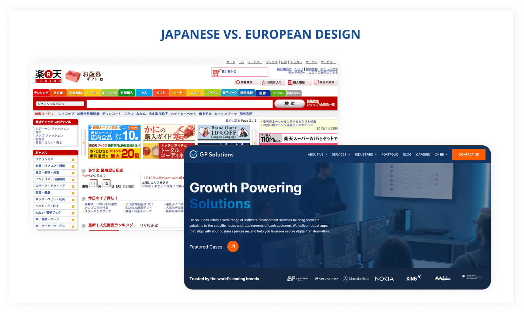
Cultural differences. For instance, the Arabs like colorfulness, many pictures, relevant cultural decorations to convey the idea of high prices and riches. It is rather different from the European approach. Japanese websites are famous for abundance of texts, bright colors, and varying fonts all on one page.
Content Creator vs. Designer
Content (your website’s structure, blocks, text volume) should come first. To start creating travel web design without content is a doomed idea because later on you will have to do too many adjustments depending on the size of the final text. Design should shape and make your content more appealing, so content is a starting point. Design highlights the important points and navigates your visitor through the content.
No rare case that clients don’t understand that quality design depends on the content and its amount. This may result in situations where designers end up cramming an avalanche of text into a block that wasn’t designed for it. Or spend extra time redesigning a page to be suitable for updated content.
The resolution lies in a mutual collaboration between the two parties, as content writers may approach the task think differently from designers.
Web Developer vs. Designer
A designer can draw anything, but you need to keep in mind that not everything can be implemented by your development team within your timeline and budget. So it will be wise to first consult your developer (or two to have the second opinion) about the possibility to implement a certain feature before proceeding to its detailed design.
This is particularly true for the integration of third-party services, as the developer knows better all the rules, especially those by large corporations like Google.
Web Design and UI/UX Services
We design websites that are effective from day one. From UX audit and benchmarking to conceptualization and user testing.
Some elements may slow down the website load speed. Or they may contradict search engine rules like the color of your buttons. You may create a minimalist design, but your SEO will ask for more texts, brighter elements, and contrast rules.
Google has designed certain technical parameters to scan websites and test elements for user-friendliness. It may turn out that what seems pretty much okay for a designer and an end user obtains low scores from Google and similar systems. Often it is more about texts and keyword density and the quality of your content, yet equally often it relates to design, for example, the visibility for poor sight people.
Contact Person vs. Designer
When working on your website, it may happen so that the decision-maker and the designer are separated by several other people in their communication chain. You cannot directly appeal to a person who judges your design. Such intermediaries may distort what you wanted to convey or lose part of the information along the way. In such cases, the development process transforms into a vicious circle of edits. All the parties involved may forget that design must attain its business goal first, which does not necessary mean that it appeals in its visual side to the decision maker.
Another problem is when you have several decision makers who have different opinions on the matter. The way out of this “approval hell” is through direct and clear communication and the desire of all parties involved to accept a compromise.
#9. Which Is Better — Custom Coding or Drag-and-Drop Designs?
DIY websites may be a viable solution for small enterprises who are tight on their budget. Just keep an eye on security mechanisms added to your final website. However, big travel players won’t argue that initial investments into website development accompanied by UI/UX design services will pay off in the long run in a much more pleasing way. Custom code delivered by software development companies bring along extra opportunities for rich functionality and customization.
Ready-made website design templates are cheaper, that’s true. In addition, they will shorten the time-to-market. However, this approach may bring its troubles along the way, especially if you own a large business and intend to scale it or if you need quality responsive layouts. Custom UI/UX design services, on the contrary, will ensure a premium website experience for your users and create competitive advantages such as scalability, flexibility, good load speed, and easy and fast updates.
#10. My Website Design Is Outdated. Where Should I Start with Its Redesign?
Before proceeding any further, ask yourself another strategic question — why do you need to launch the web design process? Is it because your website is losing visitors? Or is it merely because it reminds you of the good-old 2000s, despite bringing new bookings just as regularly? Also, bear in mind that some users will abandon you after redesign.
Don’t rush to change your website. First, find the problem and formulate the main reason why you really want to upgrade your design. Find the issue and start solving it. Talk to users and stakeholders. Sometimes old design is not an issue but your bulky workflow or slow speed and all you need is to make it simpler and friendlier for the end user.
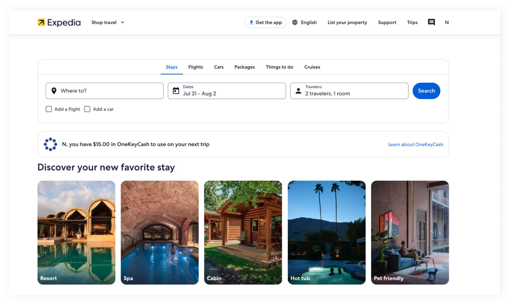
Check how Expedia’s previous, “brighter” and “more colorful” design was transformed into its simpler version, getting stripped of redundant hard-sell elements.
Previously, the website tried upselling in its hero section as hard as possible, promoting much more things besides flights and hotels in the two-line navigation menu. From the business perspective, upselling generates more revenue as the company sells more services, but for the visitor such websites may look too advertising and distracting.
Later, the design became simpler and cleaner, with fewer buttons. The navigation bar shrank from two lines to one. Now we can proceed to bookings straightaway with no need to learn what all those buttons and packages offer.
Final Say
Viktoria
VISUALS MATTER
“Looks of your website are more than just a set of pictures intertwined with copywriting. It is the first thing your client sees when they access your website. Thinking through all the visual essentials, their logic, value, and meaning should be an integral part of your marketing strategy. Purchase decisions in the travel industry follow their own peculiar scripts, so you need for your tour operator website to appeal to those passionate about travelling and align your marketing efforts accordingly.”
Natalia
All you need is to connect
Sometimes you do not need to build an entirely new tourism website, if your current platform does not meet the modern requirements. In such cases, we always advise connecting to a partner from the tech world who knows the latest trends and developments in the sphere. Even the shortest consulting session can save you a pretty penny and prevent from wasting too many efforts on nothing. You’ll like it, trust us!
Alex Shmyga
Senior Travel Tech Advisor at GP Solutions
Subscribe to our blog
Contents:
Subscribe to our newsletter
Join us in our social media resources
Thank You!
Your subscription has been confirmed. You’ve been added to
our list and will hear from us soon.
Learn the software aspect of running a DMC business. In this article, we explore the tech landscape DMCs operate in, how other B2B entities can connect to them, and what features should you expect from DMC software.
Group tours are welcomed both by tourists and tour operators, but ineffective software can drag you behind your competitors. Discover what to look for in group tour software and how to choose a tech vendor who is taking the future into account.
Get in Touch with Us!
Next steps after filling out the form:
Please expect one of our travel tech consultants to reach out to you within 24 hours.
Next, we will arrange an introductory meeting, to learn more about your challenges.
We proceed to analyze your scope of requirements, and we are open to sign an NDA if necessary.
Our travel tech consultant will prepare a formal project implementation proposal within 2–5 days after it’s taken to work.
Leave your request
We will contact you shortly
Thank you for your request!
We will get back to you as quickly as possible
Get latest insights from our travel tech experts!
Join 200+ travel fellows! Get GP Solutions' latest articles straight to your
inbox.
Enter your email address below: